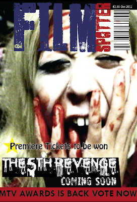
 This is our final draft of our Film Magazine cover, we designed this using Indesign. Compared to our first draft main image we feel this screen shot from our trailer works better with the horror look that we wanted to portray. We have used the same title design font and colour's as the first draft and added our film title, coming soon and an extra sentence 'Premiere tickets to be won' as we feel this would be situated on a film magazine. We wanted to keep our magazine cover reasonably simple but still contain the correct information to intrigue our target audience 15-30 year olds who are interested in horror films. We are pleased with the outcome of our film magazine cover.
Chloe
No comments:
Post a Comment