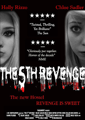
 This is the final draft of our poster, we felt that the writing looked much better in a bigger font because the dripping effect is improved. The colour's red and black shown on our poster gives the audience an idea of the genre at first glance. By putting the faces on each side of the page it shows separation and conflict between the two characters and this is what our trailer is about. Me and Chloe are the two main characters shown as enemies just through the position we are placed in the poster. Holly We made sure Holly's face was bigger than mine as she is the more dominant and powerful charcter in our trailer. Chloe
Thursday, 7 April 2011
 This is the final draft of our poster, we felt that the writing looked much better in a bigger font because the dripping effect is improved. The colour's red and black shown on our poster gives the audience an idea of the genre at first glance. By putting the faces on each side of the page it shows separation and conflict between the two characters and this is what our trailer is about. Me and Chloe are the two main characters shown as enemies just through the position we are placed in the poster. Holly We made sure Holly's face was bigger than mine as she is the more dominant and powerful charcter in our trailer. Chloe
Subscribe to:
Post Comments (Atom)
No comments:
Post a Comment