Thursday, 7 April 2011
A2 Media Coursework Evaluation
Our evaluation is now complete and has been uploaded onto you tube, it includes the Hostel trailer that influenced us to the horror genre. However, the trailers narrative is not in English, but try to ignore that :) Chloe
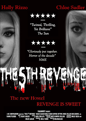
 This is the final draft of our poster, we felt that the writing looked much better in a bigger font because the dripping effect is improved. The colour's red and black shown on our poster gives the audience an idea of the genre at first glance. By putting the faces on each side of the page it shows separation and conflict between the two characters and this is what our trailer is about. Me and Chloe are the two main characters shown as enemies just through the position we are placed in the poster. Holly We made sure Holly's face was bigger than mine as she is the more dominant and powerful charcter in our trailer. Chloe

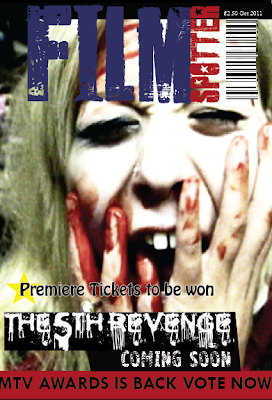
 This is our final draft of our Film Magazine cover, we designed this using Indesign. Compared to our first draft main image we feel this screen shot from our trailer works better with the horror look that we wanted to portray. We have used the same title design font and colour's as the first draft and added our film title, coming soon and an extra sentence 'Premiere tickets to be won' as we feel this would be situated on a film magazine. We wanted to keep our magazine cover reasonably simple but still contain the correct information to intrigue our target audience 15-30 year olds who are interested in horror films. We are pleased with the outcome of our film magazine cover.
Chloe
Mise en scene, props, shots and sounds
We feel that the mise en scene is perfect in regards to the horror genre, especially the front image of what you see when our trailer is displayed on blogger. It captures a gloomy, dark and isolated location which is seperate from the outside world. This image creates a verisimillitude, creating a believable world to our audience that this place ould infact see such vicious muders. On sound is from a non-diegetic source, this included a soung called 'little star' and a series of beats that helps intensify the moment. I feel that the sounds were great in making our trailer a realistic as possible, they really improved our trailer into what it is today. Originally we did include the sound of a drill, when filming the people captured in their chairs. We decided that we would cut any diegetic noice out and so this was taken out too. Our props included such things as weapons, blood, ropes, tools and other neccessary things used for education, when the acters are in college. Shots were thought about alot, as we wanted to convey as empty location without including such objects. You will notice that we included a tracking/dolly shot when the people were tied up in order to capture their emotion and the situation they were in. We used close ups in order for our audience to see every detail of emotion, this was used alot on chloe's face. Holly
How we created our evaluation questions
After complete our evaluation questions on paper, me and chloe decided it would be best to film them. We filmed it together with efforts to make it as entertaining as possible. We both felt this was a fun piece of work to do Filming is now complete, all thats left to do is edit them on imovie and add in the relevant trailers. We are very pleased that our has recieved 45 views and has only been up for 2 days! Holly and Chloe
Monday, 4 April 2011
The trailer and ancillary tasks to be in on thursday.
Evaluation questions have been started but me and Chloe plan to speak them and record us doing so, I feel this will be much more creative and will encourage us to get a better grade.
Our trailer has only just been retrieved after it was lost in the college system, this meant we weren't able to edit it for 2 weeks.
Holly
Monday, 14 March 2011
Monday, 7 March 2011


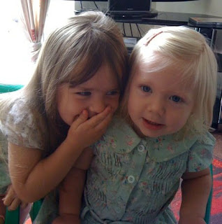
Trailer is almost finished, we are adding the final images to the sequence and when completed we are going to add the music to each scene. The images of the children are Chloe's family photo's that have been edited to create an old effect to represent the two main characters as younger children.
Chloe and Holly
Monday, 28 February 2011
Thursday, 17 February 2011
Tuesday, 15 February 2011
Monday, 14 February 2011
Having some trouble with the trailer as it keeps zooming in and out with the clips we have inserted. The magazine cover has a title and picture need some more ideas.
This week we are going to take the opportunity to find a video of 2 young girls, as this will be a major part of our trailer as it show the past. We will obviously edit this and make it look older and also add music to keep up with the genre of trailer.
Magazine cover should be finished by the end of the lesson next week.
Holly
Tuesday, 1 February 2011
Monday, 31 January 2011

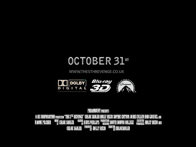
After failing to download the correct font 'Universal Accreditation' for the credits featured on film posters and dvd cases I found a similar font and managed to create my own version of our trailer credits using photoshop. I have added them to our 'coming soon' image to add to the end of our trailer. Here is the final 'coming soon' feature which the same credits will also be added to the poster and the magazine cover.
Chloe
Subscribe to:
Comments (Atom)


